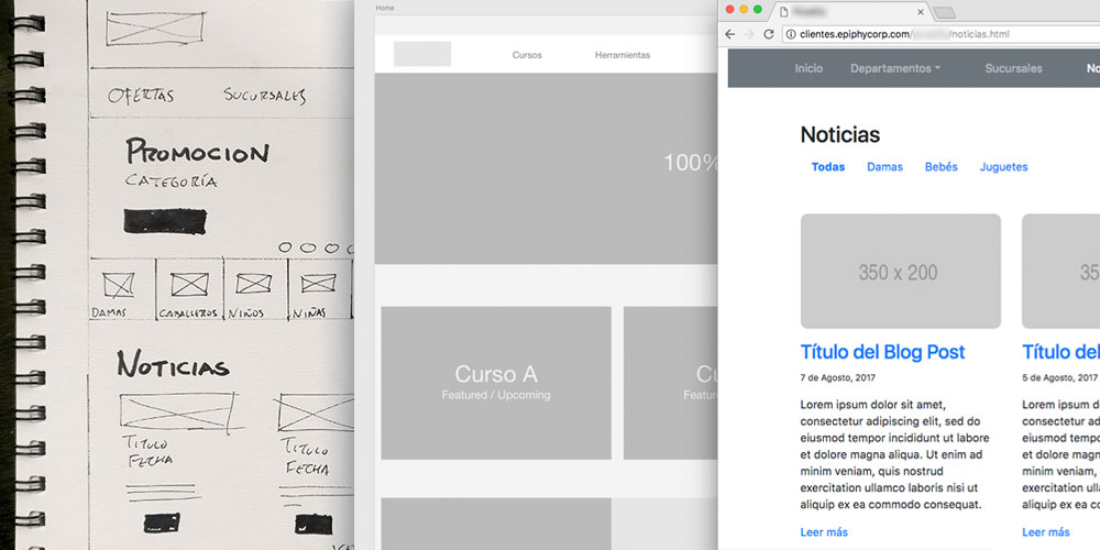
Prototyping gives us the freedom to be able to show and test our designs without having any attachment to them; so we are flexible to fix, redesign or just remove any functionality that it´s not testing well with users.
To be successful in this task, we should get into a mindset that allow us to present our products in a lo-fi or just “good enough” state, so we can quickly test to see if they work.
“Don’t prototype anything you aren’t willing to throw away. Remember: this solution might now work.”
I’ve been testing and designing both wireframes and functional prototypes with Adobe XD lately and really love it for mobile apps. But for websites, I find it a little bit constraining and just another extra step to the process. So, for the last couple of web design projects, I have started creating a working, static HTML prototype of the website, using Bootstrap. Well, more like a combination of Bootstrap, Google Fonts, Fontawesome and Placeholder.com images.

What I discover is that some clients have a hard time imagining how a site is going to work by just looking at a black and white wireframe on paper or on PDF. Sometimes they open the attachment zoomed out and can’t see the details or they focus on just one particular aspect of one page; but fail to see how a user will flow and interact from one page to the next. Having a working prototype that people (myself as the designer included), can browse, scroll and click around helps you surface any small bugs or confusing stuff you forgot to design in your initial wireframes.
This HTML prototype is less abstract to end users in testing environments, because it will look, feel and work just like a regular website; so they don´t need to push their imagination to give you feedback.
As much as I love XD, it still doesn’t replicates the feeling of browsing a site inside your browser or the effects of resizing the browser window or looking at the same prototype in your cell phone (you would need to design new artboards for the mobile version, for example). So with Bootstrap, we get a responsive, HTML functional prototype that anyone can use and feel confortable browsing, just as any other website.

It might sound like a lot of work, but if you know the framework well enough (or are familiar with it’s documentation) it can be pretty easy and fast, since you don’t have to do any CSS at this stage. The new spacing and alignments functions let you quickly add margins and padding without adding your own CSS classes.
Another benefit is that, once you reach the final version or get approval, you have more or less half of the coding ready at very early stage of the project. Still, you need to markup the approved design, but as it’s based on the prototype, you will already have the basic structure and layout.
Taking it to the next level

Trying to push the boundaries of this method, we incorporated the backend in one project that had a small delay because the client was waiting for the agency to redesign it’s brand. After testing my HTML prototype with them and some users, we started building the final WordPress site using the Bootstrap “gray” prototype as it’s template.
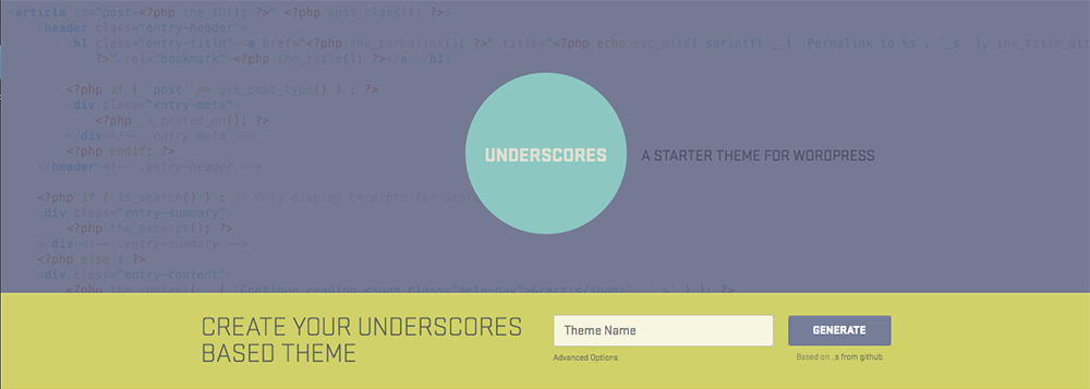
So using a base template like Underscores, that comes without any styling or layout included; we started creating our own WordPress site and then proceed to train our client on how to update it’s pages, so we could anticipate the basic content creation and input phase, working in parallel or before the visual design phase.
“My ultra-minimal CSS might make me look like theme tartare but that means less stuff to get in your way when you’re designing your awesome theme. “
So I just wanted to share with you this idea for a different way of working, where you can start earlier the markup phase and benefit from a working, web based prototype for usability testing your ideas with both clients and end users.
Resources
Here are some tools to help you prototype your websites quickly in HTML:
- https://getbootstrap.com/
- https://fonts.google.com/
- https://fontawesome.com/
- https://placeholder.com/
- https://underscores.me/
