Last year, we had the opportunity to work with the team from Banco Aliado on the user experience and interface design for their online banking website. We proposed a series of usability tests to measure the design flaws of their current solution and help us propose a better design experience based on user’s input.

01. User Research: First Round
We started by conducting usability tests on subjects from the segments this bank caters to. They offer a wide arrange of corporate and private banking services, so their customers are more business oriented that other banks.
Each round of tests would include 3 to 4 participants, just to have a good feeling on what different user groups would tell us about their experiences and to also help us identify problems they have encountered using the banking system regularly.
Using a testing account on the bank’s staging server, we were able to interview several users and a lot of points to improve, some we had figured out by ourselves, others not so evident and more oriented to corporate customers.
This interviews, as you might have guessed, are confidential, but it would be interesting in the future to work in a project where we could share some of the highlights of these tests, as they are eye opening and very informative.

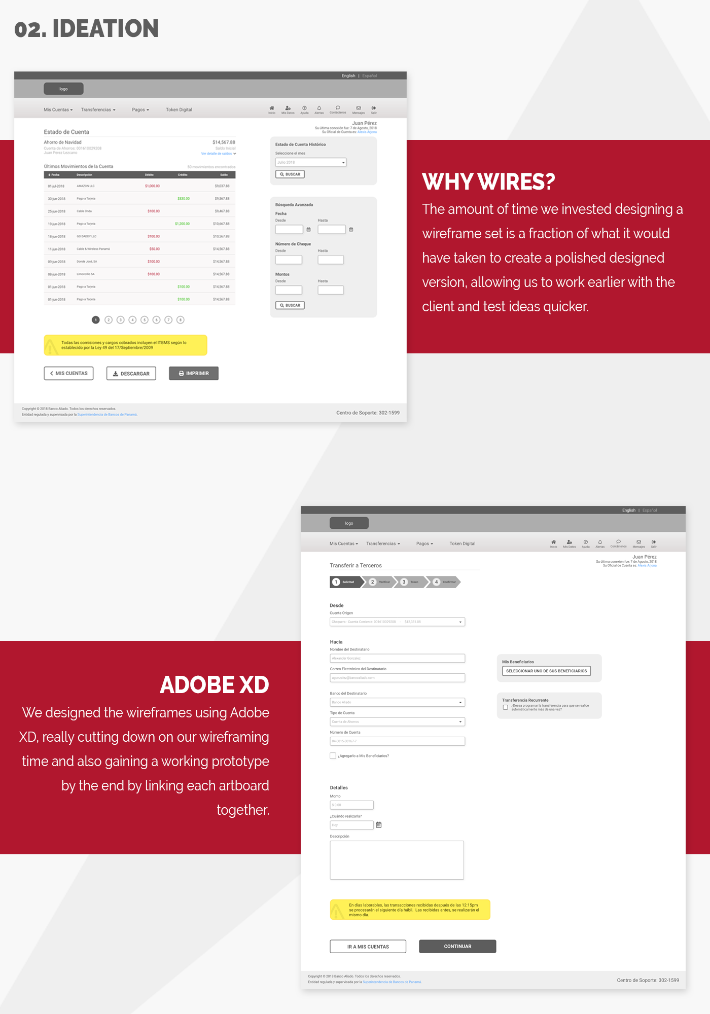
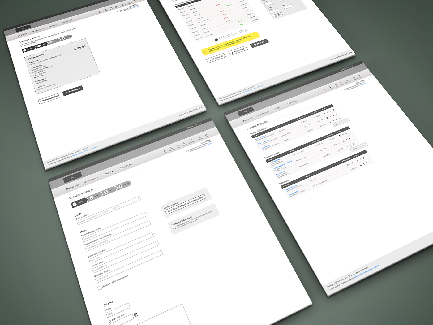
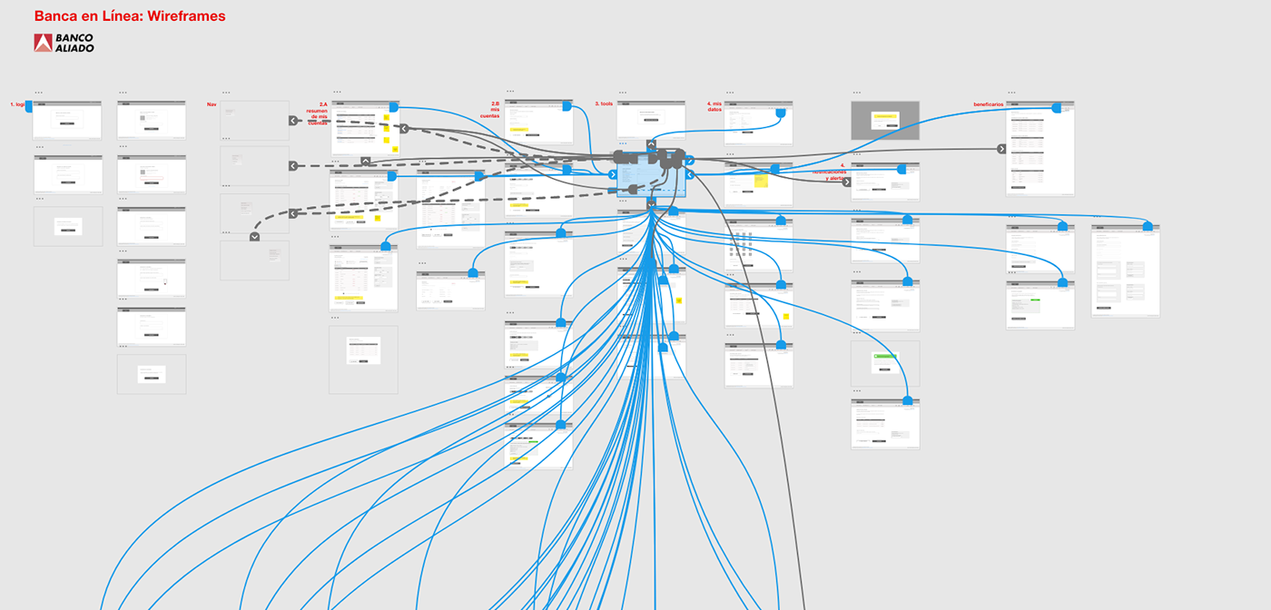
02. Ideation: Wireframes
Sketching and wireframing help us test and think about ideas or solutions early on, without investing too much time designing a polished visual proposal. Early stage, we proposed a lot of ideas, none too polished, and then we started selecting the ones we liked the most and were the best solutions for the project; then, continued to design and detail them.
The result is a set of wireframes, that let you understand the flow of each feature inside the application, how you transfer money from one account to another, or how to you see you bank account statement, for example. For this project, we wireframed the complete online banking application, for personal and corporate banking.
03. Prototype
After we mapped the whole application and wireframed it, Adobe XD allowed us to link each art board or “screen” with each other, creating a working prototype without writing a single line of code.
This prototype gives you two benefits: an easy and understandable way of presenting the project to the client, instead of showing them a PDF with each screen or a print-out; and giving you the platform to conduct more usability tests with other users before the coding phase.
04. Usability Tests: More Rounds
So we conducted tests with subjects that owned their own business or worked for big enterprises or multi national conglomerates to see how easy to use was our design. We tested these versions of the design:
- Wireframes
- Visual Design Proposal (as a XD prototype)
- HTML version
- Mobile HTML version
For each test, we had a simple script that explained the process to the subject and asked them to execute several tasks, things like transfer money from one account to another, make a payment to a service (electricity or internet, for example), change his password, etc.
The user segments were very broad, both in age and in education level. Some are over 60 year old, high level managers or CEOs; others, very young professionals just out of college, who work in the previous group’s companies; and finally, we have the staff members who have a very diverse education level, different ages, diverse familiarity with computers, etc.
The tests results helped us get better insights and ideas on how to fix details, beyond the client’s feedback. The iterative user experience design process also empowered us to take some decisions and propose design or content changes that where later reviewed by the client and tested with a new group of users.
All these tests were conducted and recorded using Silverback, with the exception of the mobile version, where we needed to use a combination of a screen recorder on Android and a GoPro to film the person’s reactions.

05. UI Design
We based our visual design on both our research findings, the approved wireframes and the bank’s brand book. One challenge of this project was the bank’s main brand color: red! But we managed to use it to highlight some elements and contrast it with shades of gray and white, to have a more pleasing experience.

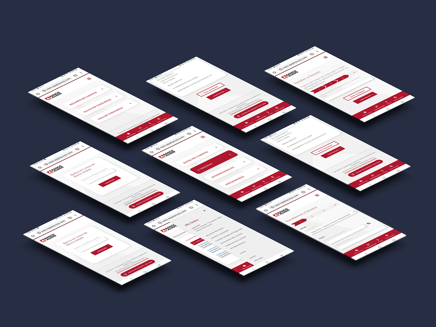
06. Implementation and Mobile Version
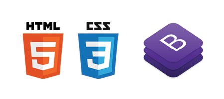
We coded everything following web standards and based on Bootstrap for an easy to understand, and easy to implement markup that could be integrated into their online banking system software by their development team.
We tested every screen on multiple browsers and mobile devices and are very happy and proud with the result.
On every project there are always challenges and constrains, like time, flexibility of the software platform or company policies. But we had a great understanding and collaborative teamwork with the bank’s team and the banking software provider. We look forward to working on future online banking user experience design projects to try out other methodologies, technologies and design ideas.