2018 was a very busy year for us, between projects, training and redesigning our space, we didn’t get much free time. As the year approaches it’s end, I wanted to share some of it’s highlights:
Training
I had the opportunity to take two classes this year: one was the equivalent of a postgraduate degree in graphic design, taught by CVT Center, an Adobe Certified Training Center. It was a long program, we studied for a year and a half, going from the very basic of Gestalt, composition and color theory, to creating whole product catalogs, infographics and our very own custom made typography.
In each module we took a deep dive into a different Adobe program and passed the tests to get certified in both Adobe Illustrator and Photoshop. Sharing with the teachers and my fellow students for practically two years, was an incredible learning and creative experience that has fueled my interest and sharpen my eye in design.
The other class I took was: UX Design and Prototyping for Educators, from Adobe Education Exchange, an online training program. The course title immediately grabbed my attention, because I was teaching a UX Design Course, so it was a good fit.
Teaching
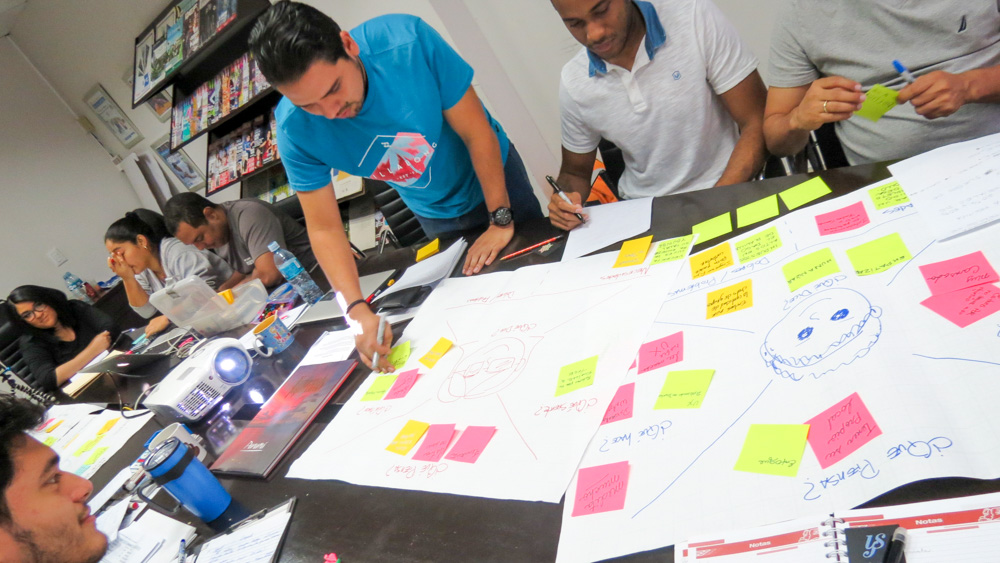
We taught a 9 week UX Design Workshop to the team of designers of EPASA, one the biggest newspaper here in Panama. We worked for nine days discovering the different aspects of UX Design, taking some tips and tools from both Design Thinking and Google Design Sprints.
The group was very enthusiastic, it was a mix of print newspaper designers, designers from marketing, web designers and developers with different levels of experience under their belt. We provided them with interesting and useful information and techniques that they could immediately apply in their daily job the next day.
We had a heavy emphasis in research: interviewing, empathising and collecting data from their users, and then analysing and presenting this data in ways they could collaborate with their teams. They had lots of fun doing card sorting exercises, mapping and sketching their apps, and finally they began to form groups and work together on designing a functional prototype of a project they could propose to their supervisors.
Writing
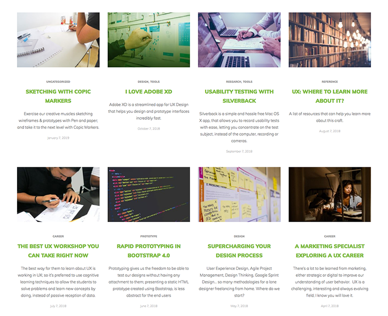
We actually started this blog in 2018. Even though our new site was published on 2017, I didn’t invested time writing articles until January.
I really love writing, but never do it. I noticed that forcing myself with a monthly schedule has helped me improve my writing skill, as the quality of the posts is gradually improving each month. This schedule also provided me with an excuse to study more about UX and to stay informed.
OCN Host Redesign
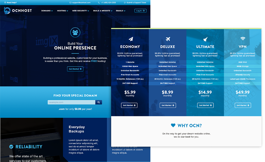
We worked on this project starting at the very end of 2017, and published it early last year: OCN Host is a hosting provider with a very cool branding, that needed a website that reflected their new image and personality.
We sketched out and then tested different options in Adobe XD. This process allowed us to quickly think about several ways to present the information and guide the user to the product they are interested in. XD’s prototype functionality simplified the presentation process, making an abstract black and white wireframe, come to life as an interactive piece
At the implementation stage, instead of jumping directly into WordPress to implement the design, we worked in a couple of iterations: first coding everything in static HTML/CSS files using Bootstrap as a framework, to test how the content would look and work in different screen sizes and when we reached a version we where happy about, then proceeded to implement over WordPress.
Muy Lila e-commerce
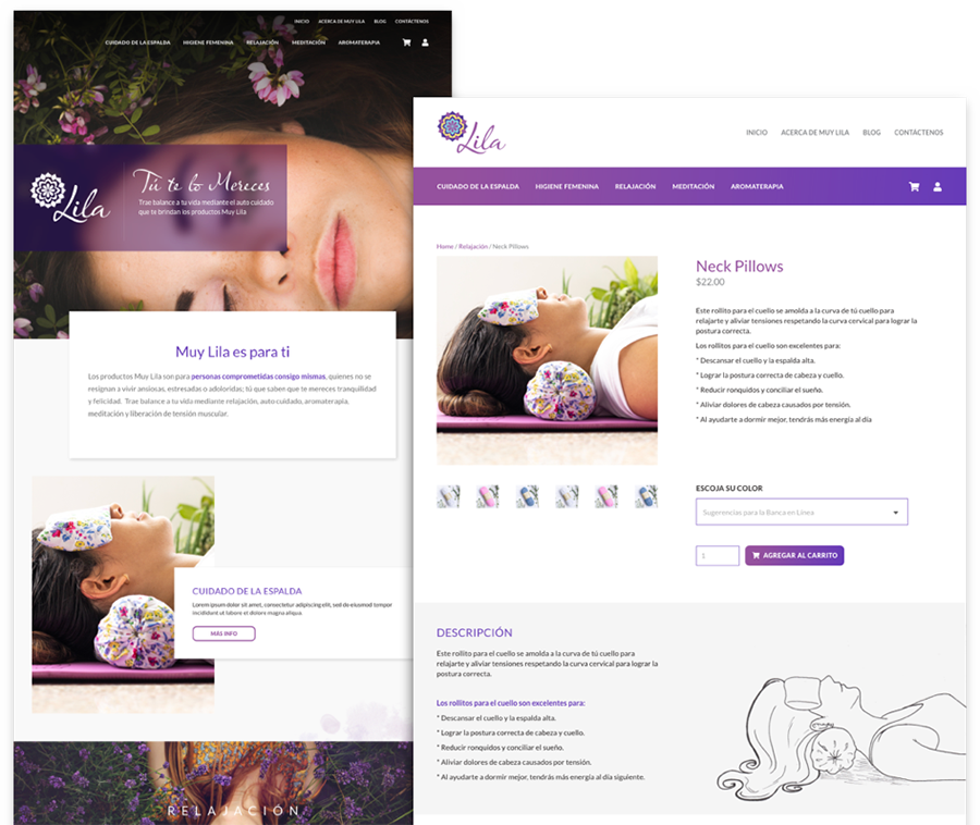
Muy Lila is a local brand of self care, relaxation and aromatherapy products that sell online to the Panamanian and Colombian markets. They had separate websites, one for the company, another for their online store and two other landing pages for product categories; so they needed an integrated solution to have a simpler, organized online presence that showcased the value offered by their incredible line of products.
Working with Lila was a blast, we had a lot of fun doing user interviews, reviewing market information provided by them and creating user personas with very defined user paths. We proceeded to sketch and wireframe a solution and then designed a proposal. This was a very iterative process, going to each round and polishing our understanding of the brand and their clients.
From the visual design perspective, this is one of the first projects that I worked 100% on Adobe XD. Don’t get me wrong, I migrated to XD years ago for the wireframing phase, but I was still designing or collaborating with designers that created the proposals on Photoshop. On this case, we wireframed everything on XD, and after it was approved, used the same layouts to create the visual design on top.
User Experience Design and User Testing for Banco Aliado’s Online Banking
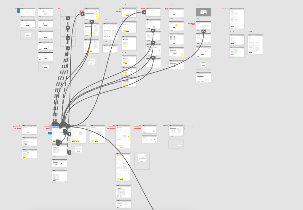
We just delivered the last batch of HTML templates for this project, but now the Bank’s software development provider needs to start implementing the design over their code, so it’s not live and sadly, we can’t share the design.
This project was very interesting, we had the opportunity to run four rounds of usability tests: one for their current banking system; one with our wireframes, using an interactive prototype created in Adobe XD; another with the final design, testing the HTML templates we built and finally, another round with the HTML, but in mobile devices. All these tests were conducted and recorded using Silverback, with the exception of the mobile version, where we needed to use a combination of a screen recorder on Android and a GoPro to film the person’s reactions.
The tests results helped us get better insights and ideas on how to fix details, beyond the client’s feedback. The iterative user experience design process also empowered us to take some decisions and propose design or content changes that where later reviewed by the client and tested with a new group of users.
It was a long process and we hope to share the designs with you once it’s published.
The Shape of Things to Come
On 2018, we also worked on a ton of other web redesigns, lots of landing pages, iterative improvements of live websites, digital marketing strategies, presentations, banner designs, etc… too many to list here; but these experiences fill us with hope and wander of the things that 2019 will bring. See you next year.
