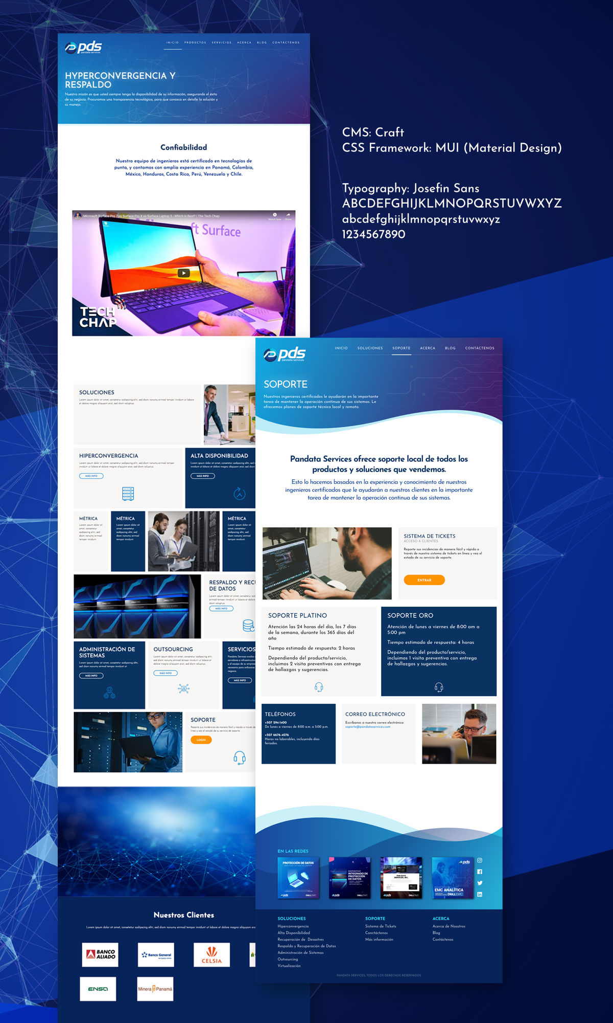
Here’s a preview of a project we are still working right now. Pandata is an IT services company who provides backup solutions to enterprise clients here in Panama.
They have a particular aesthetic in all of their communication and social media presence, so we followed a combination of references including futuristic UI, dark mode, circuitry and gradients to propose a website design that aligned to their branding and still be user friendly and responsive.
I have been following the !important podcast and was particularly inspired by some of their highlights of CSS animations and transitions, so was eager to animate some elements to give the user more feedback on small interactions.

UI Iterations
The UI evolved over time, changing from a “wavy” design on both header and footer, to a more square design. We had animated those waves to add some movement but in the end, it was too distracting, so we changed to a very subtle and subdued fractals that dance on the background of the header.

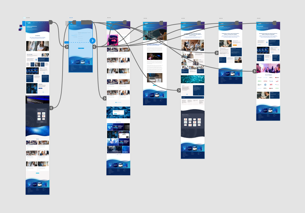
XD Prototype
This project was the exception of the rule where the early stage deliverables weren’t as helpful for the client team as in all other projects. Maybe the way you load the XD prototype via the browser wasn’t friendly enough or the abstraction of navigating a prototype wasn’t as helpful, but we had to jump to a HTML version of the design to receive better feedback from the client. At that stage we decided to move from the waves to the straight header, a decision sadly taken after investing many hours coding and animating those waves, but still it was better to fix that detail at that time than to do it later on when we had the site built on top of the CMS.
One takeaway from this project is that not all clients are the same, and even though we follow the UX or Design Thinking methodologies, some of it’s practices won’t be that helpful on some particular projects, or not very informative with some professionals. You have to adapt and bring the more valuable tools for each particular project.

Implementation
I have been researching alternatives to Bootstrap for some time now. Our last project was built using Materialize CSS, that is a fine replacement, but the project hasn’t been updated in quite a while. At the present time, it has over 500 issues reported on GitHub and almost 180 pull requests with no feedback. The project appears to be funded via Patreon, but somehow there aren’t any news about updates to the framework. Frankly, it would be great if someone else could take the reigns of the project instead of letting it fade away.
So, on this case, we tried out MUI, a Material Design CSS Framework alternative, that is even simpler, cleaner and has less clutter and Materialize. But, I’m still not satisfied, I had to custom code a lot of functionality, spacing and margin classes that we need to use; so, we might try another one or code a flex or grid CSS custom layout in the future.

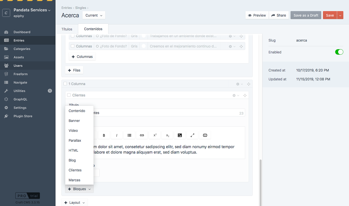
For this project we decided to go with Craft CMS, instead of WordPress. Craft offers a huge amount of customization and control on your content types and fields, plus enhanced security and paid support.
The creation of re-usable content blocks to be programmatically loaded on separate pages, instead of depending on hard coded content repeated across many pages was very useful. We also coded flexible content blocks, so we had a lot of flexibility building each individual pages and be able to reorganize them in the future.

Visit the site
It’s live now, go check it out
